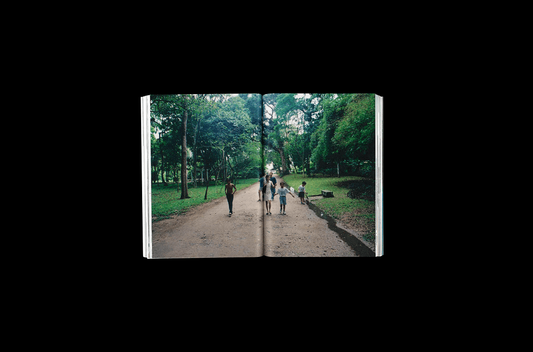
Hamilton Watches
Step Outside (2023 — 2025)
Step Outside (2023 — 2025)
BRAND 360
CAMPAIGN
ART DIRECTION
EDITING
WEBSITE DESIGN

Hamilton Watches
Engineered Garments Limited Edition
Engineered Garments Limited Edition
ART DIRECTION
CAMPAIGN
STUDIO PHOTOGRAPHY

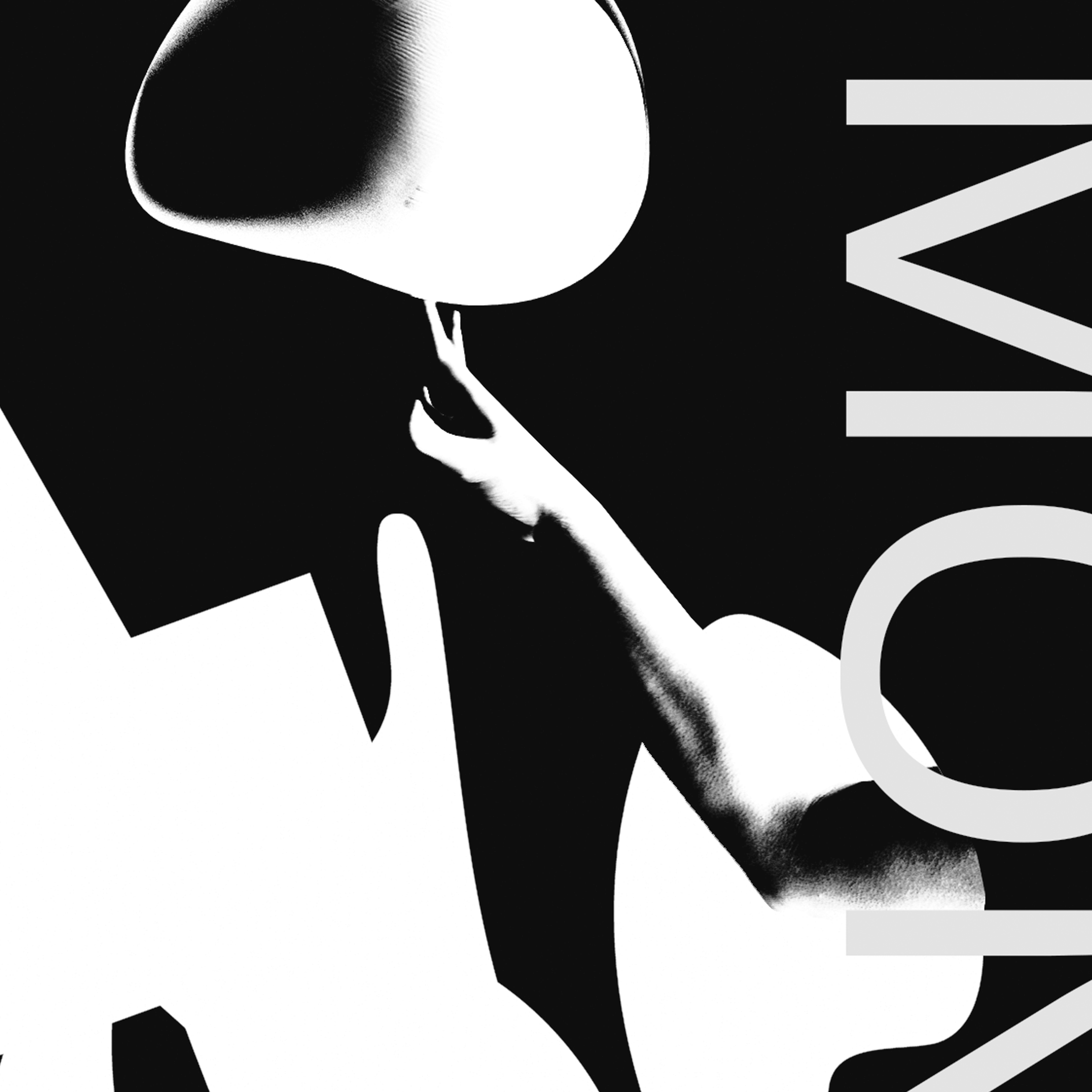
Zimpler Payments
Instant. Direct. Now.
Instant. Direct. Now.
MOTION DESIGN
BRAND IDENTITY
DESIGN SYSTEMS
WEBSITE

Fjord Switzerland (Accenture Song)
Building Future Together
Building Future Together
VISUAL IDENTITY
MOTION DESIGN
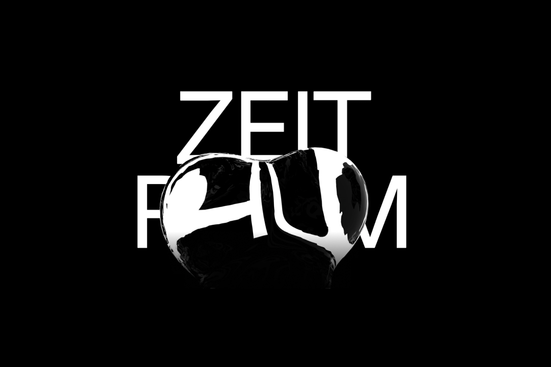
Zeitraum
Festival of Motion
Festival of Motion
MOTION DESIGN
VISUAL IDENTITY

Visual Research
Design Exploration on Emptiness
Design Exploration on Emptiness
RESEARCH
WEBSITE
MOTION