Part of Accenture Interactive, Fjord is a design service/innovation consultancy that reimagines people's relationships with the digital and physical world around them. In my previous role at Accenture Interactive/ Fjord, I contributed with an identity concept and creation that would reflect Fjord Switzerland within Fjord Global. Each Fjord, around the world, has its sub-identity within the primary organisational brand. Therefore, the challenge was to keep linked to the global Fjord without becoming a separate entity — new, but recognisable.
The approach to this challenge was to redraw the F as a foundation and reinterpret the identity in a creative-oriented direction, unlike a standalone logo, this approach encourages exploration and experimentation delivered by a logo that lives and grows in a flexible identity system and maintains its recognition.
Info
The client was a Swiss company that aims to launch a new greener energy source as an alternative to noisy diesel generator. It’s a shipping container - size battery that gets re-charged through hydro power and is delivered to events, festivals and outdoor venues straight from the power plant.
This was unrealised CVI (proposal), it was presented during early stage as a concept for how this brand could be brought to life. The approach was to develop an identity that would work from B2B (direct audience) and B2C (indirect audience) whom attend these events, including the green organisations who influence and raise the sustainability concerns with the stakeholders in mind.
Info
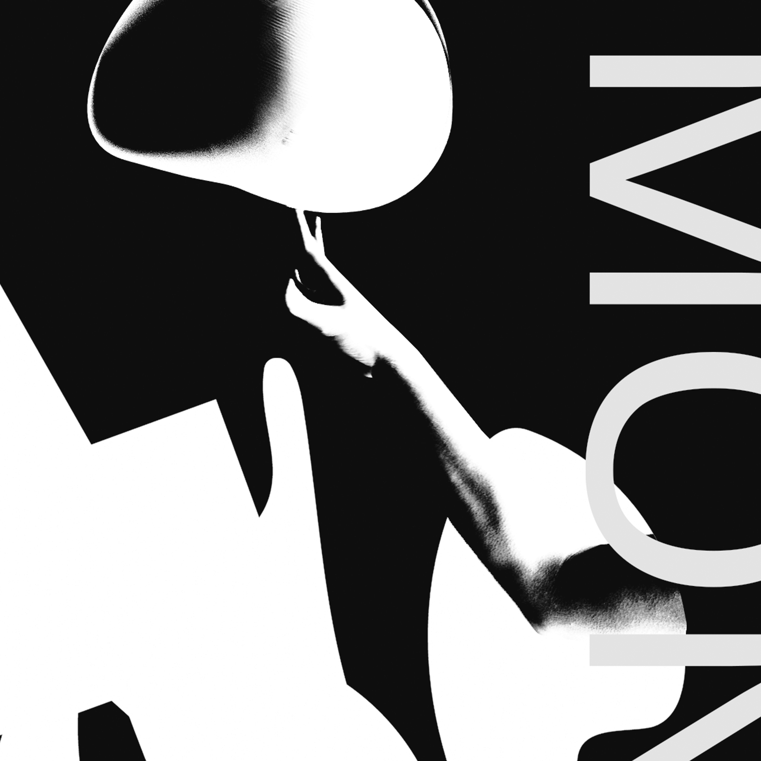
This thesis project investigates the interdependece in visual communication in a experimental, and oriented by a theorical-practical approach. The Research combines the theoretical framework, followed by a practical design experiments to develop visual languages with a goal of formulating a poster series, as the medium, that aims to create a visual experience based on the interdependence through the visual elements of typographic form and image.
The methodology employed can best be described as empirical and causal, supported by other methods such as observation, analysis, comparison and analogy. The project is simultaneously research-based in its conceptual dimension permeated by a philosophical tone, and practice-based regarding its visual designing dimension.
Info
Poster series for a fictional event about moving graphics. The approach developed for the moving posters were based in the interaction of time, rhythm and contrast.While exploring with the moving image in the design process, it was created few versions of the outcome.
Info
Based on the function ’Text to Points’, We create a tool that can help you to create your version for different typefaces. These typefaces are composited by different shapes, including 2D and 3D shapes. You can easily type the word which you like and use the sliders on the right top to change the wave mode, wave speed and the size of the shapes.
Info
Posterslam is a poster exhibition that occurs every semester at the Basel School of Design (IVK). During this term, it was introduced “State of Being” as the theme for the exhibition. My contribution to this event, was a typographic poster printed in silkscreen with the quote “State of Being” expressed through designed letterforms.
Based on a series of visual experiements with letterforms, a visual study was conducted to visualize the different levels of interpretations and dimensions with legibility and form could reach the viewers attention. By printing the poster in silkscreen, it led the viewer to experience the message on a visual and physical level, from reading in distance until coming closer and feel the haptic structure while touching on the letterforms giving the state of presence.
Info
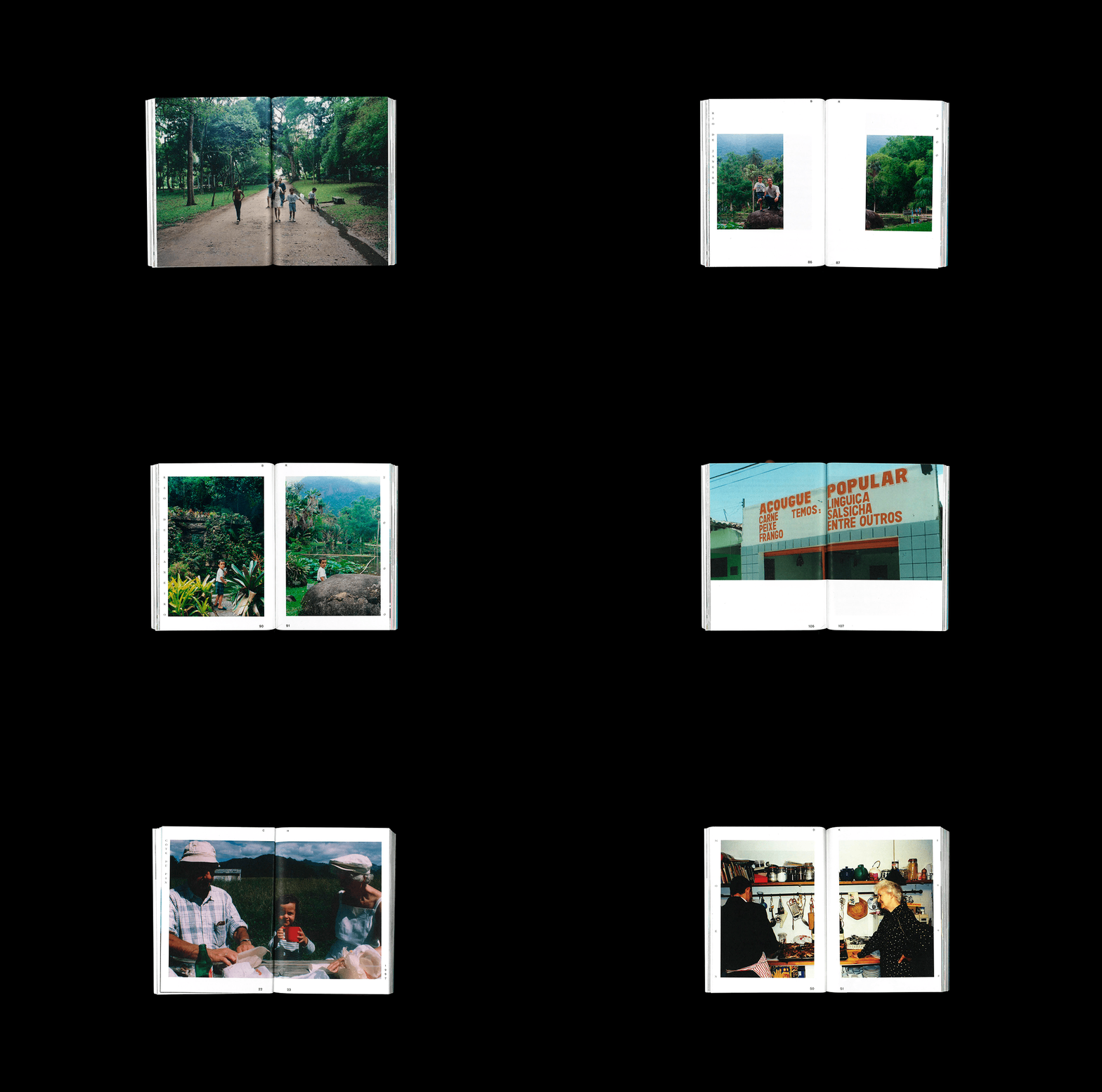
Coming from a multicultural and diverse family background, this book explores different journeys from my childhood when I used to visit my family roots in Switzerland, Denmark and Brazil.
Each journey (chapter) begins from an entire frame (no margins) as continuous landscape to introduce the reader the location and the starting point of the story. Thus, the typographic setting is composed within a frame that follows the narratives with the stories.
The chosen fonts were intended to create contrast between the reminding the old memories to the new times in which the images were archived.
Info
In the Authorship course, it was intended for the designer to create a series of visual images explored within different techniques. These images were supported by a depth of visual investigation with the purpose to describe the designer himself as content within four chapters (techniques): typographic form, graphic shapes, photography, and slogan.
Throughout the process, the approach was supported by a humour and ironic message as well as connecting the different elements from graphic shapes into typographic form with contrast of organic/static forms composed towards a final poster design.