Creative designer based in Zürich with international roots and work experience across Nordics and Switzerland, specialising in branding, digital, and motion-driven. Currently open for work. Previously Hamilton Watches (Swatch), Bold Scandinavia, EY Doberman and Accenture Song
Email
Phone
LinkedIn
Phone
alexnielbo@gmail.com
+41 (0) 79 963 41 65
/alex-nielbo
+41 (0) 79 963 41 65
/alex-nielbo
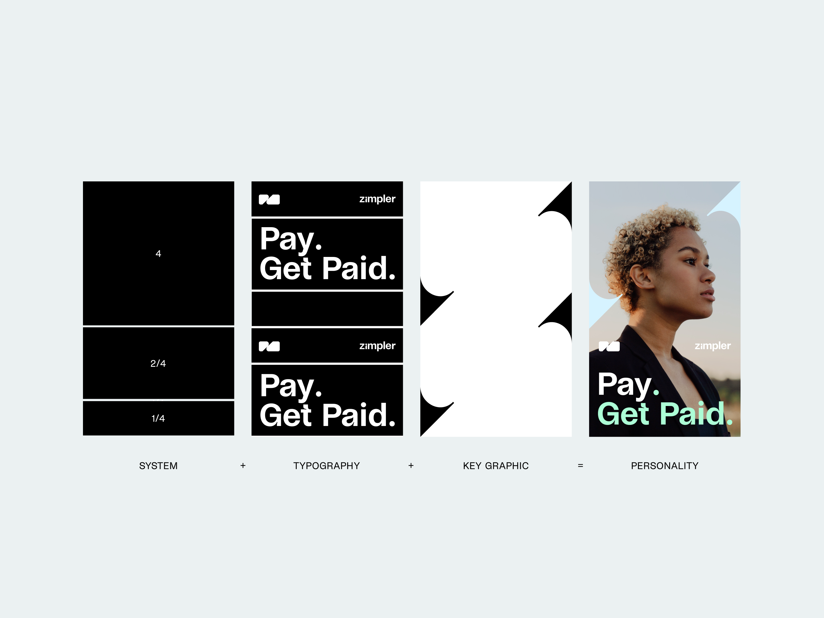
Zimpler Payments Pay. Get Paid.
Zimpler is a cutting-edge payment method for forward-thinking individuals who value instant and direct transactions without delay. It's a reflection of a fast-paced, on-demand lifestyle and a tool for living life to the fullest.
We introduced a new brand identity for Zimpler with a digital-led approach. The concept of "instant response" translated into a visual language based on responsive behaviours, giving the brand a snappy and progressive energy, and expressions of unruly personalities. The identity includes a distinct typeface, a vibrant and unique colour palette, an energetic image style and a versatile but module-based layout system.
We introduced a new brand identity for Zimpler with a digital-led approach. The concept of "instant response" translated into a visual language based on responsive behaviours, giving the brand a snappy and progressive energy, and expressions of unruly personalities. The identity includes a distinct typeface, a vibrant and unique colour palette, an energetic image style and a versatile but module-based layout system.
Client
Zimpler Payments AB
Team
Alex Nielbo, Petter Eklund, Torbjörn Kihlberg, Christina Damsgaard
Key Role
Key Visual, Motion, Bespoke Type, Website
Industry
Fintech & Finance
Year
2023
Scale
Postion
Personality
Motion Principles
Behaviour
Behaviour
Based on responsive behaviours, motion principles were created to shape the entire design system from type, graphics, imagery, and calls to action behave; creating a scalable, flexible, and immersive brand experience.
Motion curve:
Time: 20 fms, Velocity: 90/100
Time: 20 fms, Velocity: 90/100


Logotype
Dynamic Symbol
Dynamic Symbol
Zimpler’s logo is simple and instantly recognisable, helping it stand apart from competitors. The expressive cuts evokes an active expression of payment.
Digital
Website Design
Website Design
The goal was to translate the brand into digital across user flows, wireframes, and usability. From micro-interactions, hover effects, and smooth transitions, it carried the identity into every layer of the brand experience.
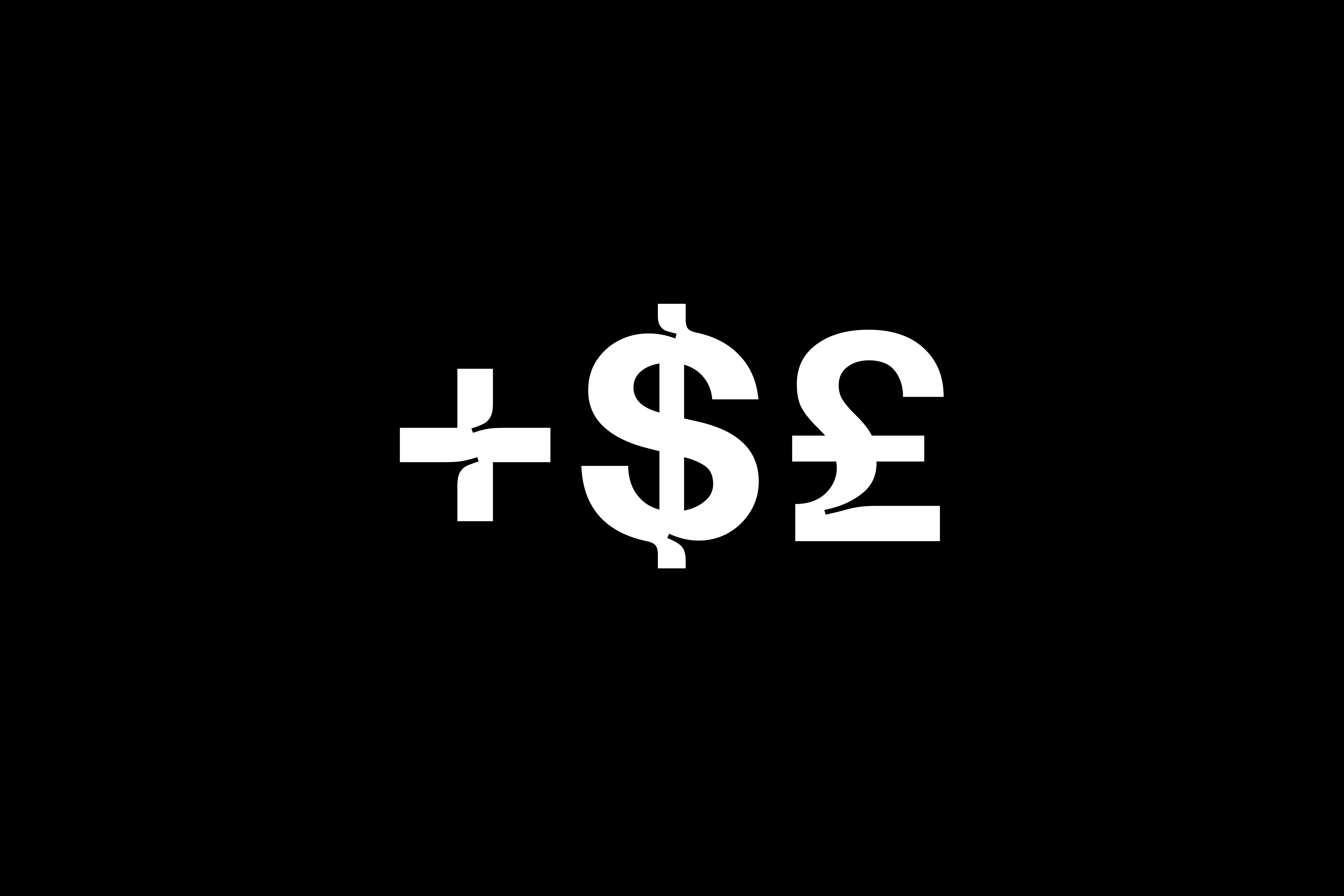
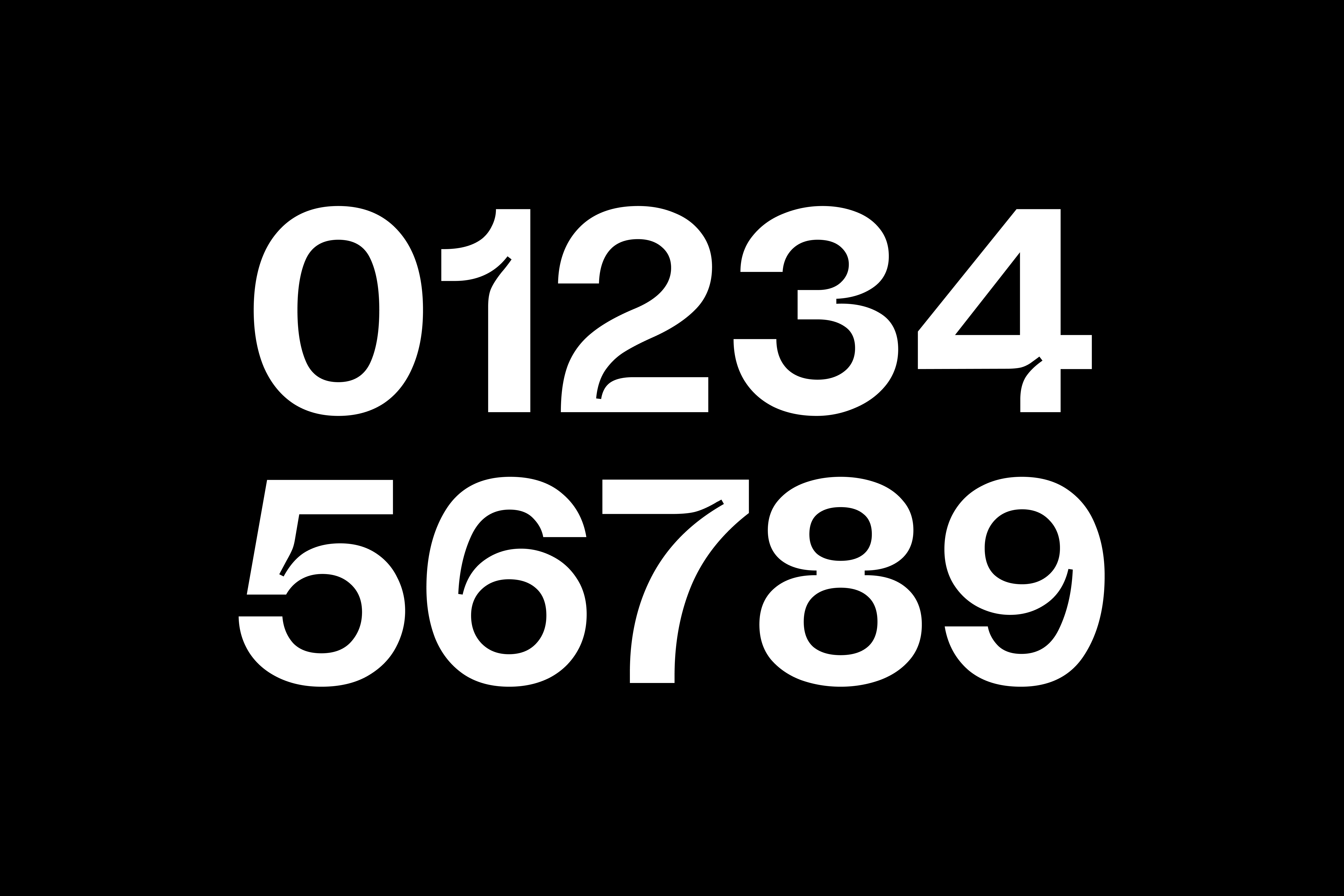
Bespoke Type
Zimpler Grotesk
Zimpler Grotesk
The identity uses a distinct type system with expressive headlines and functional body. I designed bespoke numerals— a core element of the identity— with expressive cuts widely used even in the most limited applications of the brand.

Hamilton Watches All Year Around Campaigns
At Hamilton Watches, I worked as an in-house Brand Designer and Art Director at HQ (2023–2025). Part of the Swatch, Hamilton carries over 130 years of heritage. I contributed to the brand experience and global advertising guidelines, leading 360° marketing and art direction, and delivering end-to-end omnichannel campaigns across print, digital, web, motion, packaging, and OOH.
Production Teams
Stephan Zimmermann, Zach & Perry, Kutuko
Role
Brand Experience, Art Direction, Global Ad Guidelines
Industry
Lifestyle & Luxury
Year
2023 — 2025
Evolving 130-Year-Old Brand for Today
Digital-first global ad guidelines used worldwide across all touchpoints—print, digital, OOH, POS, and SoMe
Digital-first global ad guidelines used worldwide across all touchpoints—print, digital, OOH, POS, and SoMe
When I joined, the guidelines were fragmented, complex and it was slowing brand creative. Markets often misused, and required approval loops which diluted the brand impact.
Owning the guidelines, I had the opportunity to redefine and rebuild into a digital-first system with an Ad plan, improving operational workflows, brand clarity and opportunities to create impact across each touchpoint. This new format helped markets to execute independently and consistently, removing friction and allowed real-time updates and corrections. It led the brand to have more impact on the creative flows and stronger art direction dedicated to each platform with optimized content.
Owning the guidelines, I had the opportunity to redefine and rebuild into a digital-first system with an Ad plan, improving operational workflows, brand clarity and opportunities to create impact across each touchpoint. This new format helped markets to execute independently and consistently, removing friction and allowed real-time updates and corrections. It led the brand to have more impact on the creative flows and stronger art direction dedicated to each platform with optimized content.
+40%
increase in ROAS on Meta Ads (2023-2024)
300%
sales volume with optimised content
5.9 ROAS
2024 most successful year in paid ads sales campaigns

Project Collaboration
Engineered Garments Limited Edition
Engineered Garments Limited Edition
Hamilton teams up with Engineered Garments to launch the Hamilton Khaki Field Titanium Limited Edition (Ø36mm).
The campaign celebrates a collaboration built on shared philosophies — drawing parallels between rugged utility, timeless design, and military heritage.

.png)
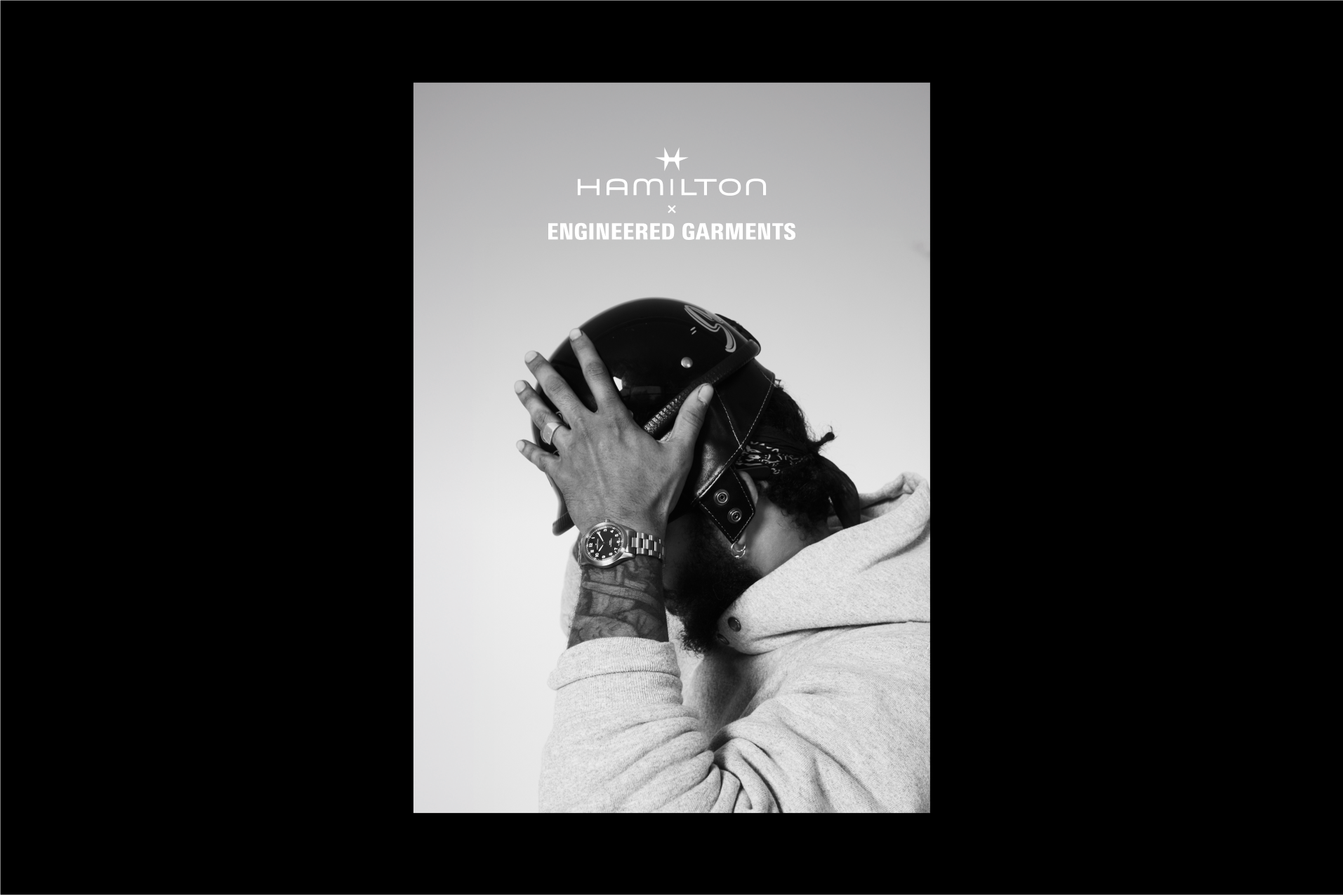

This configuration epitomizes the ideal field watch, both contemporary and timeless, embodying the essence of Hamilton Khaki × Engineered Garments
Daiki Suzuki – Founder of Engineered Garments

Fjord Dynamic Symbol
In my previous role at Fjord, a design and innovation consultancy under Accenture Song, I contributed a visual design concept to our team with a sub-identity for Fjord in Switzerland.
The identity reinterprets the official F logo forward into a tridimensional dynamic symbol was based on the core idea of "shaping" and "building" together.
The identity reinterprets the official F logo forward into a tridimensional dynamic symbol was based on the core idea of "shaping" and "building" together.
Designer
Alex Nielbo
Special Thanks
Claudia Niemeyer, Thales Molina, Sarah Semple
Client
Fjord, part of Accenture Song
Industry
Consulting Innovation
Year
2021


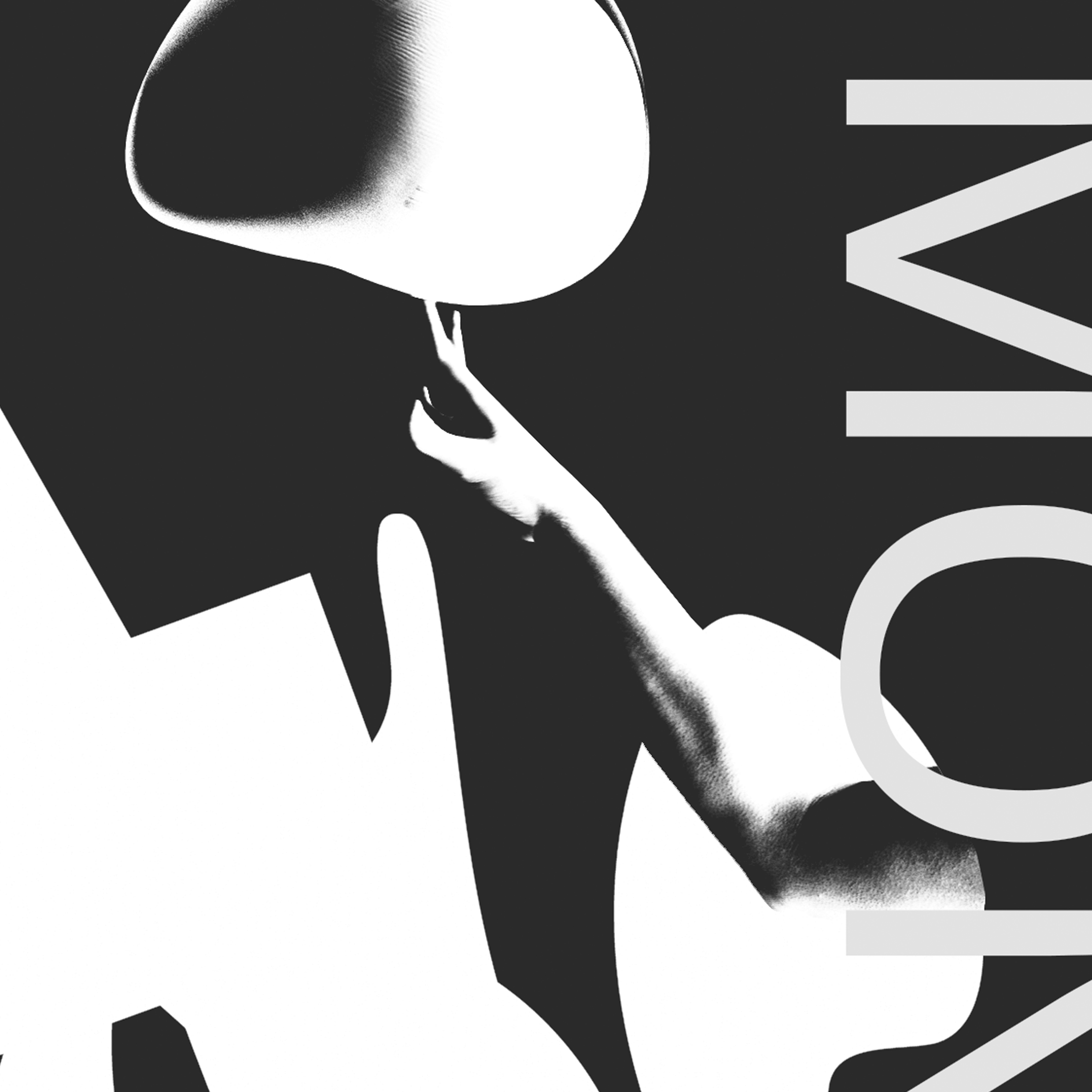
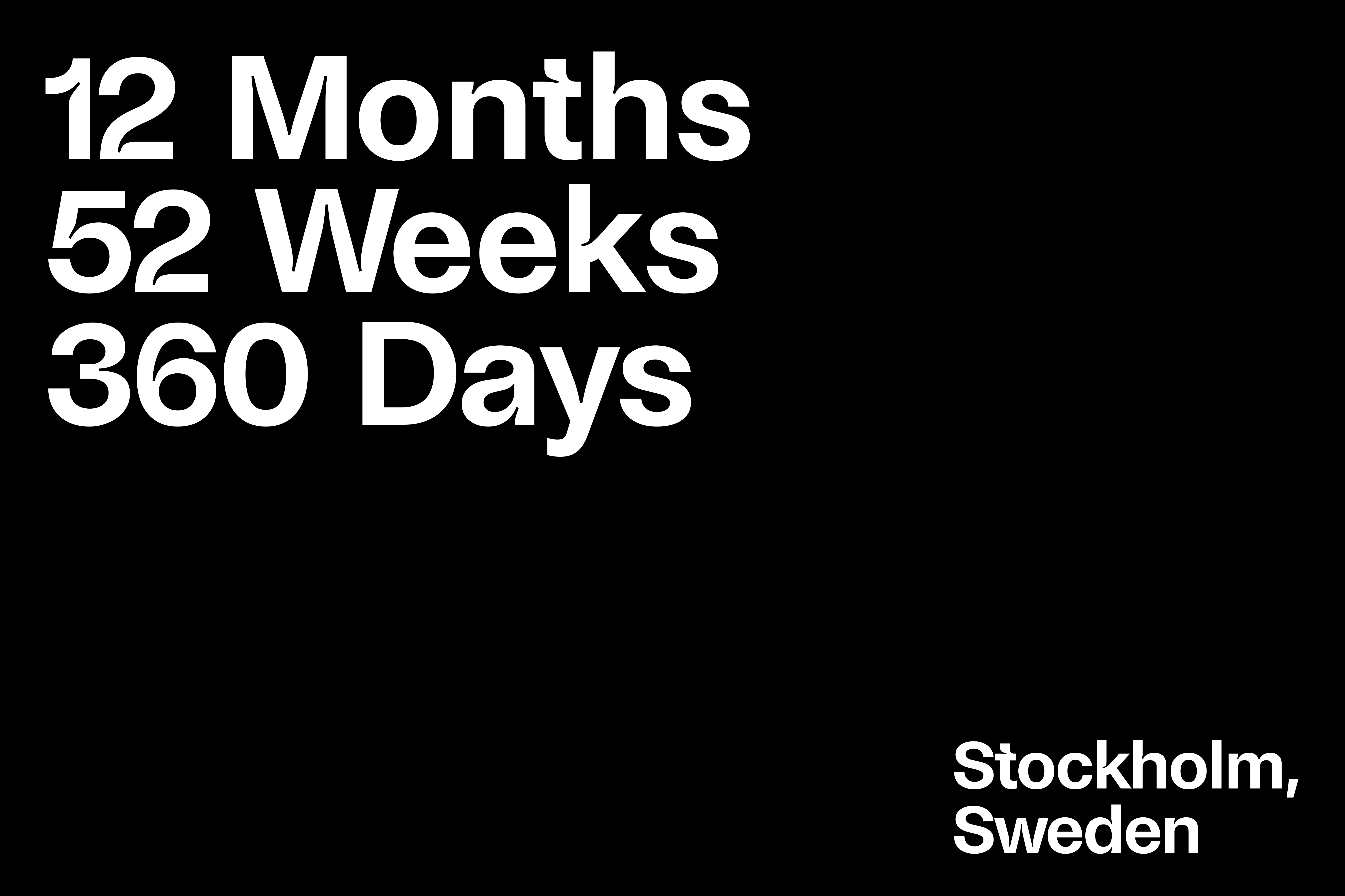
ZeitRaum Motion Festival
Background
This poster campaign was designed for an event focused on motion graphics festival. The concept plays with the intersection of time, rhythm, and contrast creating a bold and simple visual motion poster.
Designer
Alex Nielbo
Industry
Entertainment & Events
Year
2019
Archive A Book About Memories
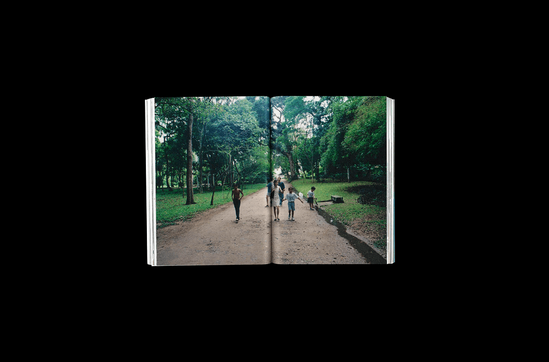
Growing up in a multicultural and diverse family, I have always been fascinated by the different journeys I took to visit my family roots in Brazil, Denmark, and Switzerland.
This personal project explores fragments of memories from my childhood. Each journey (chapter) is introduced with a continuous landscape that sets the stage for the story that follows.
The typographic setting is composed within this frame, giving shape to the narratives and stories. The dual font selection creates a contrast of memories and the modern times in which the images were archived.
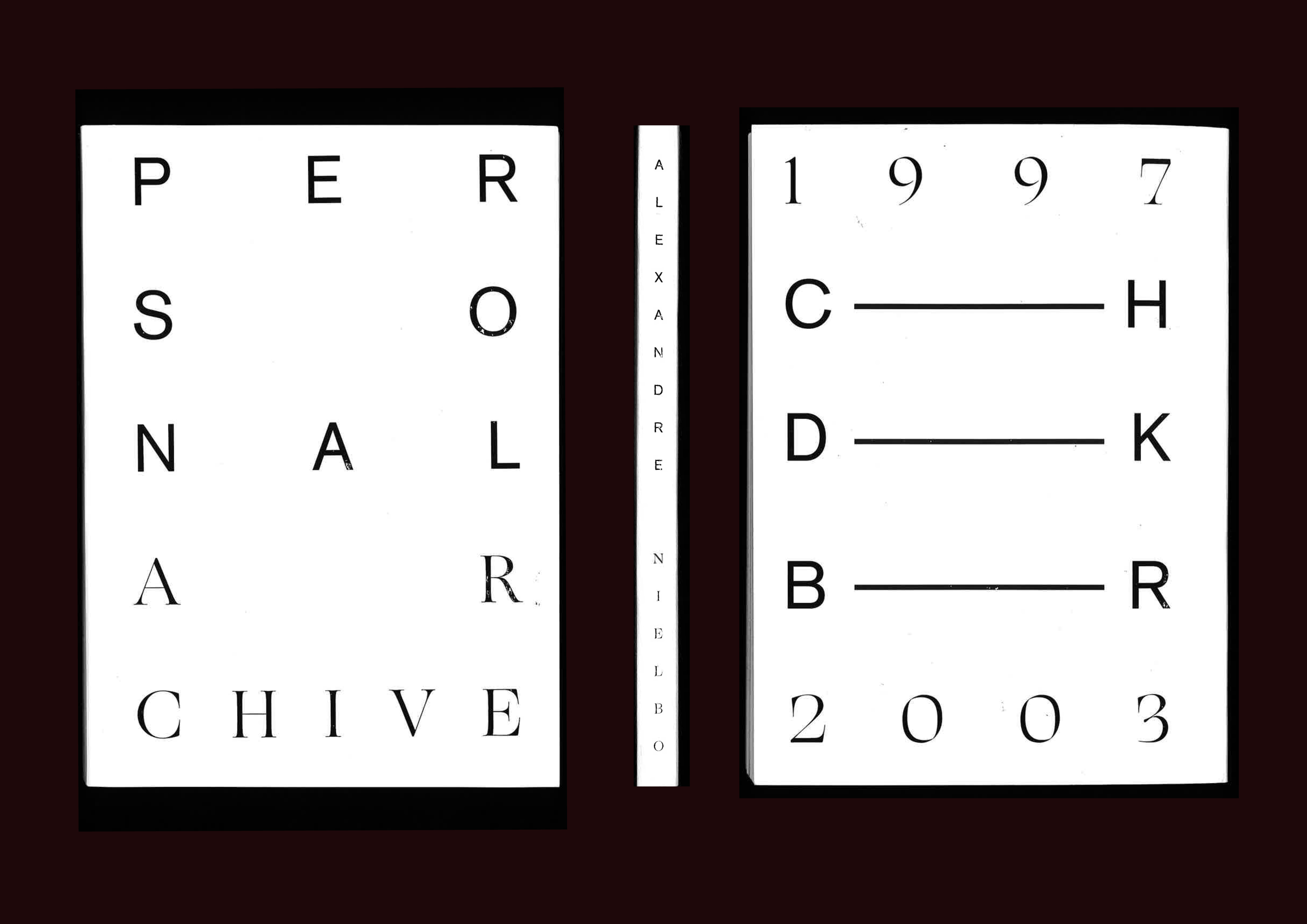


Publication Design Exploration on Emptiness
As part of my thesis, I published a research project that follows a theoretical-practical approach into applying concept to visual communication. Through experimental, practice-led research, it uses posters, typography, and iconography to translate the concept into visual form of "emptiness."


Authorship Form and Context

A series of visuals designs through four techniques. These images were supported by in-depth visual explorations with content within four chapters (techniques): typographic form, graphic shapes, photography, and slogan.
The approach for this project was to incorporate humor and irony into the message, as well as connecting the different elements from graphic shapes into typographic form with the contrast of organic and sharp forms. At the end, it was developed a catalogue with these designs that later was composed into a final poster design that showcases one element from each technique.
The approach for this project was to incorporate humor and irony into the message, as well as connecting the different elements from graphic shapes into typographic form with the contrast of organic and sharp forms. At the end, it was developed a catalogue with these designs that later was composed into a final poster design that showcases one element from each technique.